Friday 23 April 2010


Thursday 22 April 2010
Website Analysis
This is the website front page for my A2 Media Studies G325 Advanced Portfolio.

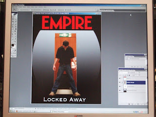
The size of the canvas was made to represent the exact size of a website I have analysed previously, to add verisimilitude to my own product. This size was 800x800 pixels – the most basic template for my background and other images.
I decided that the first set of pictures did not work well and I was forced to stretch the images to fit the page. Another issue with the images were that they did not portray the genre of the trailer in the correct way, which is an important aspect of this advertising campaign. However, I reassessed which pictures could be used as an alternative, by searching through my photographic stills, for my website front page and stumbled across this picture. This image works well as it portrays a simplistic background, which can have images moulded around it, as I have done.

Another important change I made to the image is that I used it in black and white. The reason for this is that it provides an enigma, as to the location of those within the framing of the final front page. As mentioned in my main evaluation, the darkness conveyed within the image is synonymous with fear which then represents the aim of the title aswell, that the characters are “Locked Away”
From this, I added a black bar to the bottom of the image, which is where all the titles and and certificate logo will go. This is a typical code of most websites, and the colour of the bar being black represents the ongoing fear being conveyed by the website front page.
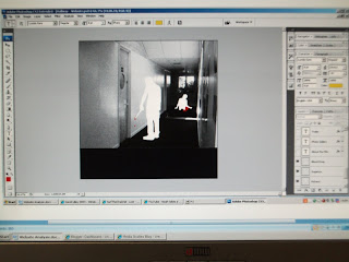
The idea for this website meant that I wanted the red of the blood to distinctively contrast with the black and white of the background. The reason for this is that it reinforces the horror theme of the film by emphasisng the “blood”. Another reason for the use of the “blood”, is to portray the link between the killer and the victim within the image.

These are the titles I have used within my website to portray the credits section seen on most websites. These titles are typical codes of such websites and I have used a black background to reinforce the horror genre theme. I have also used a significant amount to represent the amount used on many other website front pages.
Thursday 15 April 2010
List of Software

Photoshop: I have used this programme for the two print based tasks. The diverse range of tools has meant that replicating my ideas has been an easy task, although, getting to know the programme at first was a struggle.

Adobe Audition: This was the programme used to record and edit my radio production. It allowed me to experiment with different sounds and reorganise parts more easily than “Windows Movie Maker”, which is the programme I used in the AS year to edit the audio.

Microsoft Word: Although the most basic programme I have used for the production of this campaign, it has also been the most important, with a lot of documents created for blog updates, amongst other things.

Dreamweaver: Initially, Dreamweaver was going to be used to help create my website, however, due to a lack of time, this was scrapped and just the front page, without links was created.

Adobe Premier: This programme has been vital in the editing of the film trailer. In the AS year, “Windows Movie Maker” was used and our group decided that this did not allow for a diverse edit of the film. This programme allows for easy movin g around of shots and easier editing.
Tuesday 13 April 2010
Main Evaluation
The process of creating an advertising campaign, has led to a deeper understanding of the way I need to target an audience, as well as working on previous knowledge from the AS coursework. Without the targeting of an audience, the product may not be successful. This targeting is presented in many ways, particularly through demographic and psychographic means, whereby interest will build up, and in turn, will attract the intended audience. This also means that each product, created for this campaign, will target the same audience, however, via different mediums as well as through technical codes and conventions.
One of the most important factors binding the whole campaign together is the genre. I have taken common codes from my chosen genre, horror, such as the use of darkness to represent the fear within each of my products. The radio advertisement employs a similar technique, with tense music indicative of looming fear. There are other mise-en-scene links, such as characters and locations, which also play an important role in the attraction of a target audience. Research, both this year and last year, has helped inform my decision to use certain aspects to represent my genre, with the structuring of the film particularly influenced by film trailers.
These common links, between each product, are also created so that if a person finds out about one of the products, they can instantly obtain access to each of the other three products, which may then further entice the person into seeing the actual film. The reason behind this, is the extra information available to the person, such as character back stories on the front page of the website, amongst other things. Research has also informed the length of the film trailer and the sizes of the magazine and website. This is critical as I am attempting to emulate a real life product and the more accurate the diegesis, the more likely the audience member will purchase the product.
In what ways does your media product use, develop or challenge forms and conventions of real media products?
Due to the size of the campaign, it has meant extensive research into previously mentioned topics of things like genre, so that an accurate account of each product can be produced. It has also meant that efficiency between each of my group members has had to be high, so that we could complete these tasks. I have drawn on many of the codes and conventions from my previous film, produced in the AS year, and then thought about what went well and what didn’t. This gave me some insight into what needed to be completed for this year, the A2 campaign, as well as limiting possible mistakes.
The production of the film in the AS year has also meant that I have a better understanding of which codes and conventions match well with a genre, and from this I could experiment with certain ideas during the production of the film trailer this year. Subverting an idea, rather than going with the norm, can sometimes lead to audience member feeling surprised, and in turn, creates a deeper degree of enigmatic content, which that audience member will then want to find out. I have employed such techniques, referring to the larger amounts of medium shots within my trailer, than you would find in most trailers of the same genre. In particular, the scene where the characters are at the table, with a long duration, is not typical of the genre. However, I have moulded this around quick shots, which portray the danger these characters may then face. This leads to an enigma which is answered, but only to a small extent, which is the aim of the trailer.

The links between each product for this campaign is vital, as mentioned in the first couple of paragraphs. However, the reason for this is that it builds up a certain music score, sound or image, which is then directly linked to the actual film. This reinforces the perpetuation of the advertising campaign, both virally, and by word of mouth, due to the link which is drawn to the film. Research has shown that slow and dark music is a technique used to help build tension, within an audience member. When my group members and I were discussing this issue, we decided that music alongside the antagonist would make the best link, not only because it is a good way to control the emotions of an audience member, but because it can then be used across all four products. This will further aid the perpetuation of the campaign.
My group was told that due to particular circumstances, we had to create our own music. This was later changed, but too late to change our own music. I created some music, and between the other group members, we decided which would be most suited to the radio advertisement, as well as what would suit certain areas of our film. Listening to the soundtracks of the researched trailers, I felt that the most simplistic would equate to the most tense and dramatic. I also thought that over complicating the sound may actually take the audience member’s attention away from the imagery within the trailer and the information being presented via the radio advertisement.
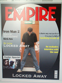
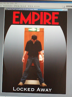
Over the A2 year, I have analysed many magazines, for the purposes of the exam questions. However, this analysis has also benefited the coursework, and has meant that knowing what to include and what not to include on the front cover is vital, and to target the right audience, the correct codes will need to be used. Genre also exists, to some extent, within magazines and is reinforced by the information and images added to the front covers. The information and images also work parallel to the codes and conventions being represented in the film trailer. This is one of the main reason I have used a dark background on my magazine front cover, as a reader of a magazine such as Empire may relate to the codes I am reproducing on my front cover.

Although understanding what was needed to create a diegetic representation of the front cover of a film magazine, getting to know the programme was much harder as I have had no previous experience using it. This has meant that a lot of time has been devoted to understanding certain tools and the reasons they are used when creating the front cover. Little details can sometimes have a massive effect.
An important example is the font. If I had used a different font to represent the “Empire” logo, some readers may not have recognised the magazine. Another crucial misconception is the fact that the size of an “Empire” magazine is thought to be the standard A4 size; however, it is slightly bigger. To combat this issue, I measured the exact size of a copy of “Empire”, and put these details into Photoshop, where I was in the process of creating the front cover. The reason these sizes are so important, is that if finalised, the magazine would have white space, which will again, lead to a reader dismiss the magazine due to lack of quality.

The website also relies on certain measurements, as I intend to accurately reproduce a website front page. The website, just like the other three products, incorporates dark colours to represent the ongoing fear. From my own research, I concluded that the darker of the two pictures I decided to use would be most suited to the website. The reason being is that it provides a stronger enigma to their location and also relates to general plot within the whole campaign – the fact that they are “Locked Away” within the school.
How effective is the combination of your main product and ancillary texts?
Each of my products will work in a synergistic manner to represent the whole campaign and its aims. This will naturally lead to a more widespread advertisement of the film trailer than using just the trailer on its own. The reason is that this campaign is meant to be virally distributed, more so than paper based, which also leads to the potential of a bigger audience, due to the way web 2 perpetuates information at an incredible speed. There is also a higher chance of coming across one of these ancillary texts by chance, which is directly linked to the fact that there is 4 times the amount of products in existence.
As mentioned before, the ancillary texts also help to provide background information which would be non-existent if only a trailer was produced. This is an effective technique as the audience member may be more inclined to go and see the film if more information is available to represent the genre and accessories to the main text.
The A2 year has also provided a more diverse knowledge of existing texts. Creating texts from varying mediums, particularly the print based products, has shown that similar codes and conventions need to exist in order for an advertising campaign to be linked via genre. During the production of these texts, a large number of unfamiliar programmes were used. This has also led to a deeper understanding of what certain programmes aim to produce and the wide variety of tools used to create these products.
This has been an effective mechanism, as using these different programmes has meant an advertising campaign which is more rounded and detailed. This, in turn, will lead to the attraction of a bigger audience, directly affected by the higher quality of the products being presented to them. The whole advertising campaign is a more complete and accurate representation of a media product, in contrast to the AS production. From research, it can be seen that advertising campaigns, containing promotions, alongside the trailer, are an effective way to target an audience.
What have you learned from your audience feedback?
Although not much audience feedback has been collected, I have asked many people their thoughts on the four products I have created since they were completed. This technique helps to aid the production by giving me information which I may not have seen the first time around in the creation of each text. Standing at an objective viewpoint leads to such discoveries and is always beneficial. The feedback which has been given has also meant that I have been able to improve my products. An example of this improvement is reinforced by the fact that I have had to film three times to obtain the shots needed for the trailer.
This feedback has not just been instant, it has developed over a period beginning from the pre production through to this evaluation. This input, most of the time, has not actively been seeked out and relects the audience’s true opinion. Another aid in this feedback has been the close proximity of the people in my group. We have been drawing on the same codes and conventions to represent our ideas, which has meant that I have been able to ask for their advice on a couple of issues.
How did you use media technologies in the construction and research, planning and evaluation stages?
Media technologies have helped advance the construction of each of my four products, however, in different ways. Due to the diverse range of texts for this task, the A2 year, it has also meant a vast range of programmes to help edit and produce them. I have oultined the use of these programmes and the aim in using them here. These programmes have meant that a more accurate production took place, particularly the film trailer, as this was the most important task for me. Although I had not used many of the programmes previously, the aim was to familiarise myself so that I could represent my ideas correctly. The process of familiarising myself can be seen, most obviously, in the way my magazine front cover has developed.
Media technologies have not just been present in the creation of texts, but it has also been used to portray ideas and evaluations through the use of web 2. “Blogger” and “Google Documents” have been key in logging thoughts and representing ideas adequately. This is reinforced by the progression of blog updates and documents being added. This has also led to the perpetuation of my advertising campaign, through popular websites such as Youtube. This reinforces the aim of the campaign directly, as advertising to the biggest audience possible is key in attracting the biggest possible audience.
One of the most important factors binding the whole campaign together is the genre. I have taken common codes from my chosen genre, horror, such as the use of darkness to represent the fear within each of my products. The radio advertisement employs a similar technique, with tense music indicative of looming fear. There are other mise-en-scene links, such as characters and locations, which also play an important role in the attraction of a target audience. Research, both this year and last year, has helped inform my decision to use certain aspects to represent my genre, with the structuring of the film particularly influenced by film trailers.
These common links, between each product, are also created so that if a person finds out about one of the products, they can instantly obtain access to each of the other three products, which may then further entice the person into seeing the actual film. The reason behind this, is the extra information available to the person, such as character back stories on the front page of the website, amongst other things. Research has also informed the length of the film trailer and the sizes of the magazine and website. This is critical as I am attempting to emulate a real life product and the more accurate the diegesis, the more likely the audience member will purchase the product.
In what ways does your media product use, develop or challenge forms and conventions of real media products?
Due to the size of the campaign, it has meant extensive research into previously mentioned topics of things like genre, so that an accurate account of each product can be produced. It has also meant that efficiency between each of my group members has had to be high, so that we could complete these tasks. I have drawn on many of the codes and conventions from my previous film, produced in the AS year, and then thought about what went well and what didn’t. This gave me some insight into what needed to be completed for this year, the A2 campaign, as well as limiting possible mistakes.
The production of the film in the AS year has also meant that I have a better understanding of which codes and conventions match well with a genre, and from this I could experiment with certain ideas during the production of the film trailer this year. Subverting an idea, rather than going with the norm, can sometimes lead to audience member feeling surprised, and in turn, creates a deeper degree of enigmatic content, which that audience member will then want to find out. I have employed such techniques, referring to the larger amounts of medium shots within my trailer, than you would find in most trailers of the same genre. In particular, the scene where the characters are at the table, with a long duration, is not typical of the genre. However, I have moulded this around quick shots, which portray the danger these characters may then face. This leads to an enigma which is answered, but only to a small extent, which is the aim of the trailer.

The links between each product for this campaign is vital, as mentioned in the first couple of paragraphs. However, the reason for this is that it builds up a certain music score, sound or image, which is then directly linked to the actual film. This reinforces the perpetuation of the advertising campaign, both virally, and by word of mouth, due to the link which is drawn to the film. Research has shown that slow and dark music is a technique used to help build tension, within an audience member. When my group members and I were discussing this issue, we decided that music alongside the antagonist would make the best link, not only because it is a good way to control the emotions of an audience member, but because it can then be used across all four products. This will further aid the perpetuation of the campaign.
My group was told that due to particular circumstances, we had to create our own music. This was later changed, but too late to change our own music. I created some music, and between the other group members, we decided which would be most suited to the radio advertisement, as well as what would suit certain areas of our film. Listening to the soundtracks of the researched trailers, I felt that the most simplistic would equate to the most tense and dramatic. I also thought that over complicating the sound may actually take the audience member’s attention away from the imagery within the trailer and the information being presented via the radio advertisement.
Over the A2 year, I have analysed many magazines, for the purposes of the exam questions. However, this analysis has also benefited the coursework, and has meant that knowing what to include and what not to include on the front cover is vital, and to target the right audience, the correct codes will need to be used. Genre also exists, to some extent, within magazines and is reinforced by the information and images added to the front covers. The information and images also work parallel to the codes and conventions being represented in the film trailer. This is one of the main reason I have used a dark background on my magazine front cover, as a reader of a magazine such as Empire may relate to the codes I am reproducing on my front cover.


Although understanding what was needed to create a diegetic representation of the front cover of a film magazine, getting to know the programme was much harder as I have had no previous experience using it. This has meant that a lot of time has been devoted to understanding certain tools and the reasons they are used when creating the front cover. Little details can sometimes have a massive effect.
An important example is the font. If I had used a different font to represent the “Empire” logo, some readers may not have recognised the magazine. Another crucial misconception is the fact that the size of an “Empire” magazine is thought to be the standard A4 size; however, it is slightly bigger. To combat this issue, I measured the exact size of a copy of “Empire”, and put these details into Photoshop, where I was in the process of creating the front cover. The reason these sizes are so important, is that if finalised, the magazine would have white space, which will again, lead to a reader dismiss the magazine due to lack of quality.
The website also relies on certain measurements, as I intend to accurately reproduce a website front page. The website, just like the other three products, incorporates dark colours to represent the ongoing fear. From my own research, I concluded that the darker of the two pictures I decided to use would be most suited to the website. The reason being is that it provides a stronger enigma to their location and also relates to general plot within the whole campaign – the fact that they are “Locked Away” within the school.
How effective is the combination of your main product and ancillary texts?
Each of my products will work in a synergistic manner to represent the whole campaign and its aims. This will naturally lead to a more widespread advertisement of the film trailer than using just the trailer on its own. The reason is that this campaign is meant to be virally distributed, more so than paper based, which also leads to the potential of a bigger audience, due to the way web 2 perpetuates information at an incredible speed. There is also a higher chance of coming across one of these ancillary texts by chance, which is directly linked to the fact that there is 4 times the amount of products in existence.
As mentioned before, the ancillary texts also help to provide background information which would be non-existent if only a trailer was produced. This is an effective technique as the audience member may be more inclined to go and see the film if more information is available to represent the genre and accessories to the main text.
The A2 year has also provided a more diverse knowledge of existing texts. Creating texts from varying mediums, particularly the print based products, has shown that similar codes and conventions need to exist in order for an advertising campaign to be linked via genre. During the production of these texts, a large number of unfamiliar programmes were used. This has also led to a deeper understanding of what certain programmes aim to produce and the wide variety of tools used to create these products.

This has been an effective mechanism, as using these different programmes has meant an advertising campaign which is more rounded and detailed. This, in turn, will lead to the attraction of a bigger audience, directly affected by the higher quality of the products being presented to them. The whole advertising campaign is a more complete and accurate representation of a media product, in contrast to the AS production. From research, it can be seen that advertising campaigns, containing promotions, alongside the trailer, are an effective way to target an audience.
What have you learned from your audience feedback?
Although not much audience feedback has been collected, I have asked many people their thoughts on the four products I have created since they were completed. This technique helps to aid the production by giving me information which I may not have seen the first time around in the creation of each text. Standing at an objective viewpoint leads to such discoveries and is always beneficial. The feedback which has been given has also meant that I have been able to improve my products. An example of this improvement is reinforced by the fact that I have had to film three times to obtain the shots needed for the trailer.
This feedback has not just been instant, it has developed over a period beginning from the pre production through to this evaluation. This input, most of the time, has not actively been seeked out and relects the audience’s true opinion. Another aid in this feedback has been the close proximity of the people in my group. We have been drawing on the same codes and conventions to represent our ideas, which has meant that I have been able to ask for their advice on a couple of issues.
How did you use media technologies in the construction and research, planning and evaluation stages?
Media technologies have helped advance the construction of each of my four products, however, in different ways. Due to the diverse range of texts for this task, the A2 year, it has also meant a vast range of programmes to help edit and produce them. I have oultined the use of these programmes and the aim in using them here. These programmes have meant that a more accurate production took place, particularly the film trailer, as this was the most important task for me. Although I had not used many of the programmes previously, the aim was to familiarise myself so that I could represent my ideas correctly. The process of familiarising myself can be seen, most obviously, in the way my magazine front cover has developed.
Media technologies have not just been present in the creation of texts, but it has also been used to portray ideas and evaluations through the use of web 2. “Blogger” and “Google Documents” have been key in logging thoughts and representing ideas adequately. This is reinforced by the progression of blog updates and documents being added. This has also led to the perpetuation of my advertising campaign, through popular websites such as Youtube. This reinforces the aim of the campaign directly, as advertising to the biggest audience possible is key in attracting the biggest possible audience.
Wednesday 7 April 2010
Progress Report - Magazine
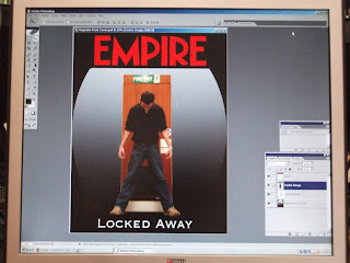
I have used my ideas from previous drawings to illustrate my magazine front cover. However, I have now also begun using Photoshop to produce the final draft of my idea, and although there may be some issues, such as using particular tools for the correct tasks, I have been able to move images and colours around to see what it looks like. I have also logged this progress through pictures which show the process by which I came to the cover I have at the moment. I believe this will help me, through trial and error, to see what can be done, and how it can be done. It will also help me If I forget how to recreate a certain tool or image I had previously made.
On the diegetic side of things, I have followed the codes and conventions from the magazine Empire, as mentioned in a previous blog update. However, I have actually begun to put these codes into my idea, and can be seen via the centralised image and similar colours to represent the characters power within the framing of the magazine. The title of the magazine has also been reproduced to show authenticity and create a further sense of attraction to the reader, who will associate themselves with the font.
I have also begun the critical evaluation for the whole Advanced Portfolio, which has meant that I have had to refer back to previous blogs and the progress I have made throughout the year, particularly with programmes such as Photoshop, where i have built up an extensive knowledge. It also means that I can analyse what has gone well for me and what hasnt over the past few months, while designing and creating this Advanced Portfolio. This will mean that when creating a similar product in the future, it will aid my understanding and knowledge and which audiences to target with which products.
On the diegetic side of things, I have followed the codes and conventions from the magazine Empire, as mentioned in a previous blog update. However, I have actually begun to put these codes into my idea, and can be seen via the centralised image and similar colours to represent the characters power within the framing of the magazine. The title of the magazine has also been reproduced to show authenticity and create a further sense of attraction to the reader, who will associate themselves with the font.

I have also begun the critical evaluation for the whole Advanced Portfolio, which has meant that I have had to refer back to previous blogs and the progress I have made throughout the year, particularly with programmes such as Photoshop, where i have built up an extensive knowledge. It also means that I can analyse what has gone well for me and what hasnt over the past few months, while designing and creating this Advanced Portfolio. This will mean that when creating a similar product in the future, it will aid my understanding and knowledge and which audiences to target with which products.

Website Planning
I have decided that this photo would be best used to represent the advertisement of the film trailer, via a website home page. The reason for this is that it physically presents each character to an audience who may want to find out more about the film, after seeing the trailer. Furthermore, the trailer does not really portray any backstory to each character, other than the fact that they are in danger. This photo works by portraying them out of character, which leads the reader to relate to them more. Codes and conventions of websites tend to provide this information to a reader, who may be interested in the film’s story and characters.

The location of this photo is also important. It shows the characters in a location which will be seen within the film, and thus, may lead the reader to be further intrigued about other areas of the film, such as the locations of filming, where information will also be given, via the website. It also leads to a non-diegetic feel, as the people within the shot are out of character.
I believe that the first image is better than the second. The reason for this is that the darkness in image number 1 creates a sense of mystery behind the characters’ identities, which will then be found out as the reader navigates the website home page. This isn’t the case for image number 2 as the light gives that enigma.
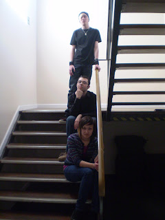
Another reason for choosing image 1 is the fact that the film presents the characters as locked within the college. However, image 2 may give the impression that it is day time, more so than the first image.
Tuesday 6 April 2010
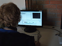
Progress Report - The Editing Phase
The editing phase of the film trailer has begun, with some anticipation. We have been using the programme “Premier”, to edit our footage, which has been collected over a period of two weeks. This equated to over 15 minutes of footage, which is being handled with care, so that we can find the best shots for each scene. It is important to note that the software, Premier”, has not been used by the group before, which has meant that learning the basics has been an integral part of this phase in the production of the film trailer. On the other hand, it has provided more freedom with the editing in comparison to “Microsoft Movie Maker”, which was used in the production of the Foundation Portfolio film.
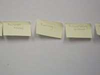
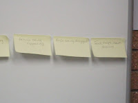
Although we filmed over a period of two weeks, the storyboards were always being changed, as new ideas were thrown onto the drawing board. This has led to a reorganisation of particular scenes, so that we can portray the horror of each character in more depth. This links back to the editing programme, as these shots can easily be swapped around to convey the horror as well as potentially making more sense. However, we still felt as though this was taking up too much time, so reverted to sticking post-it notes with labels on the board. These each represented a scene in the film trailer, which we organised on the white board.

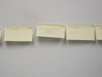
The sound effects we planned to use have been incorporated well, in my opinion. The maccabre sound of the music does create a sense of tension and fear, which again, I genuinely felt when watching a rough edit of the first few scenes. Heavy breathing and darkness, synonymous with fear, have also been used within the first few scenes to build up the dread, which the characters will be feeling, and will also relate to the audience’s perception of fear.
It must also be mentioned that there was an issue with the ratio of the framing. We had filmed the first set of scenes in a ratio of 16:9, and the second an third in 4:3, which meant that they did not match up. However, we discussed how this problem could be solved and came to the conclusion that by adding a black bar to the top and bottom of the frames, not only will it create a sense of a cinematic experience, - adding to the tension of the scenes, as this extra black will create fear, but it will also mean that the frames will match up.
Subscribe to:
Posts (Atom)
