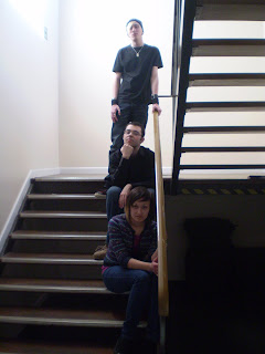
The location of this photo is also important. It shows the characters in a location which will be seen within the film, and thus, may lead the reader to be further intrigued about other areas of the film, such as the locations of filming, where information will also be given, via the website. It also leads to a non-diegetic feel, as the people within the shot are out of character.
I believe that the first image is better than the second. The reason for this is that the darkness in image number 1 creates a sense of mystery behind the characters’ identities, which will then be found out as the reader navigates the website home page. This isn’t the case for image number 2 as the light gives that enigma.

Another reason for choosing image 1 is the fact that the film presents the characters as locked within the college. However, image 2 may give the impression that it is day time, more so than the first image.

No comments:
Post a Comment