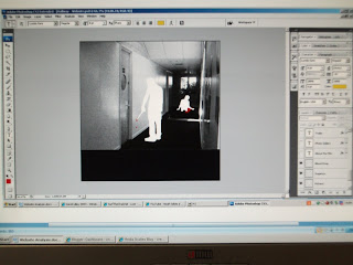
The size of the canvas was made to represent the exact size of a website I have analysed previously, to add verisimilitude to my own product. This size was 800x800 pixels – the most basic template for my background and other images.
I decided that the first set of pictures did not work well and I was forced to stretch the images to fit the page. Another issue with the images were that they did not portray the genre of the trailer in the correct way, which is an important aspect of this advertising campaign. However, I reassessed which pictures could be used as an alternative, by searching through my photographic stills, for my website front page and stumbled across this picture. This image works well as it portrays a simplistic background, which can have images moulded around it, as I have done.

Another important change I made to the image is that I used it in black and white. The reason for this is that it provides an enigma, as to the location of those within the framing of the final front page. As mentioned in my main evaluation, the darkness conveyed within the image is synonymous with fear which then represents the aim of the title aswell, that the characters are “Locked Away”
From this, I added a black bar to the bottom of the image, which is where all the titles and and certificate logo will go. This is a typical code of most websites, and the colour of the bar being black represents the ongoing fear being conveyed by the website front page.

The idea for this website meant that I wanted the red of the blood to distinctively contrast with the black and white of the background. The reason for this is that it reinforces the horror theme of the film by emphasisng the “blood”. Another reason for the use of the “blood”, is to portray the link between the killer and the victim within the image.

These are the titles I have used within my website to portray the credits section seen on most websites. These titles are typical codes of such websites and I have used a black background to reinforce the horror genre theme. I have also used a significant amount to represent the amount used on many other website front pages.

Well written article. What I think that Both Google analytics and webmaster tools needs to be synced and linked in order to get the optimum results and analytics.
ReplyDeleteenhancing customer experience